Enhancing Data Visualizations with Matplotlib's Color Options
Matplotlib is a versatile library that offers a variety of unique features and functionalities for creating captivating visualizations. In this guide, we'll explore features to add color to our plots!
Installing Matplotlib
First, if not already done, install the Matplotlib library:
pip install matplotlibAlternative Approaches
Sometimes pip will not configure correctly in your environment. In such cases, alternative approaches can be used for installation. Here are two methods:
Using py:
py -m pip install matplotlib
Using python3:
python3 -m pip install matplotlib
Importing Matplotlib
Once installed, you can import the Matplotlib library:
import matplotlib.pyplot as plt Four Methods for Changing Color Using Matplotlib
The color of plots in Matplotlib is set to blue by default.
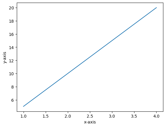
Below, we will explore four methods to change color in line charts. Keep in mind this can be used in other plot functions.
Example 1: Change Color Using Color Names
We can add a color parameter to different plotting functions plt.plot(), plt.scatter(), plt.bar() to specify the color of lines, markers, or bars.
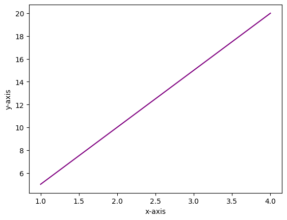
In this example, a color name was assigned to the color parameter:color = 'purple'.
Example 2: Change Color Using Color Codes
Matplotlib also lets you use single-character abbreviations to represent colors.
Below are the color codes available for use:
'b': blue'g': green'r': red'c': cyan'm': magenta'y': yellow'k': black'w': white
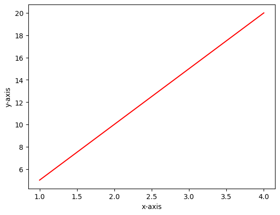
In this example, the color code 'r' was assigned to the color parameter to make the line red.
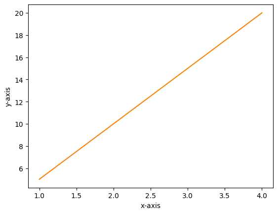
Example 3: Change Color Using RGB Values
RGB (Red, Green, Blue) values can be used to specify custom colors. RGB values are specified as tuples where each component ranges from 0 to 1.
(1, 0, 0) = red(0, 1, 0) = green(0, 0, 1) = blue
We can create intermediate colors by adjusting the amounts of red, green, and blue components. For instance, (1, 0.5, 0) represents full red, half green, and no blue, resulting in an orange color. Here is the resulting plot using RGB:
Example 4: Change Color Using Hexadecimal Color Codes
Hexadecimal color codes, or hex color codes, offer a wide range of custom colors for our plots. Each code is composed of six characters, combining numbers from 0 to 9 and letters from A to F. These codes represent different intensities of red, green, and blue, allowing us to create unique and customized color palettes for our visualizations.
Below, we will explore two examples:
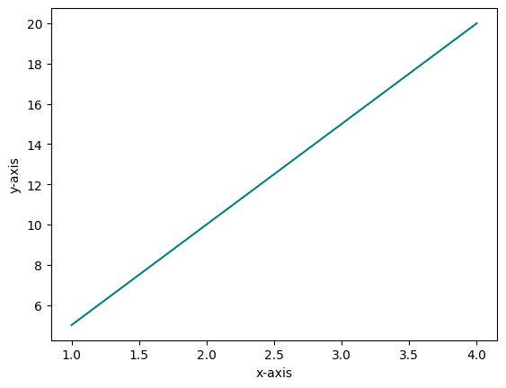
#008080represents teal:
- The first two digits
00represent the absence of red. - The next two digits
80represent maximum intensity of green. - The final two digits
80represent maximum intensity of blue. - Combining these, we get a teal color.
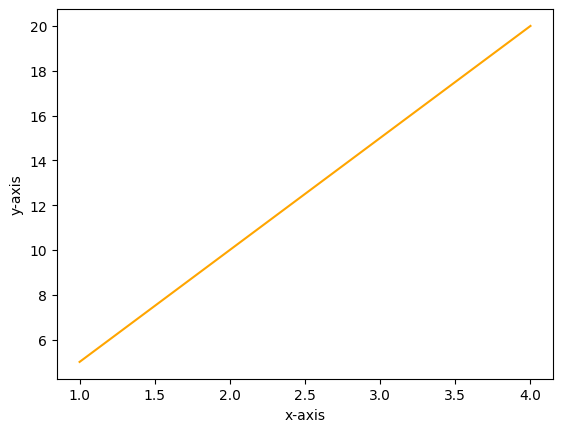
#FFA500represents orange:
- The first two digits FF mean maximum intensity of red.
- The next two digits A5 represent a specific intensity of green.
- The final two digits 00 mean no blue color contribution.
- Combining these, you get an orange color.
Conclusion
Matplotlib offers various ways to change colors in plots through color names, color codes, RGB values, and hexadecimal codes. Learning these methods can help make your plots more engaging, clear, and visually appealing. Happy plotting!