Creating Simple Data Visualizations in Python using matplotlib


As data scientists, our job is to use data in order to solve problems. Data Visualization helps us make visual sense of the data that is hidden behind cluttered spreadsheets.
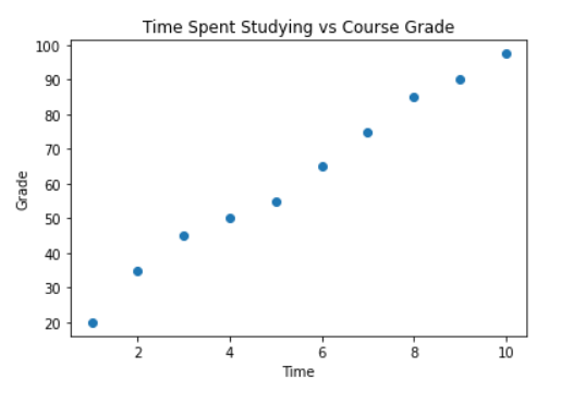
Scatter Plot

Scatter plots are used to represent the relationship between two variables. Below, we will observe how a scatter plot is used to show the relationship between time spent studying and the resulting course grade.
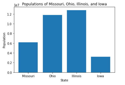
import matplotlib.pyplot as plt # Here, we are going to import Matplotlib, a plotting library for Python.
time = [1, 2, 3, 4, 5, 6, 7, 8, 9, 10] # Here, we are going to define the amount of time spent studying in hours.
grade = [20, 35, 45, 50, 55, 65, 75, 85, 90, 97.5] # Here, we are going to define the resulting grade as a percentage.
plt.xlabel("Time") # Here, we are going to define the x-axis of our scatterplot.
plt.ylabel("Grade") # Here, we are going to define the y-axis of our scatterplot. 
plt.title("Time Spent Studying vs Course Grade") # Here, we are going to define the title of our scatterplot.
plt.scatter(time, grade) # Here, we are going to plot the scatterplot.

Simple Scatter Plot Using matplotlib

Creating a Scatter Plot in Python using matplotlib

Bar Chart

Bar charts are used for representing a quantity or quantities with a bar. Below, we will observe how a bar chart is used to show the population of Missouri, Ohio, Illinois, and Iowa.
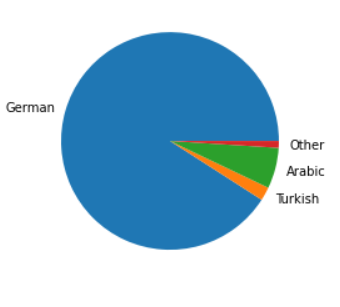
import matplotlib.pyplot as plt # Here, we are going to import Matplotlib, a plotting library for Python.
state = ["Missouri", "Ohio", "Illinois", "Iowa"] # Here, we are going to define the states. 
population = [6154913, 11799448, 12812508, 3190369] # Here, we are going to define the states' populations.
plt.title("Populations of Midwestern USA States") # Here, we are going to define the title of our bar chart.
plt.xlabel("State") # Here, we are going to define the x-axis of our bar chart.
plt.ylabel("Population") # Here, we are going to define the y-axis of our bar chart.
plt.bar(state, population) # Here, we are going to plot the bar chart.

Simple Bar Chart Using matplotlib

Creating a Bar Chart in Python using matplotlib

Pie Chart

Pie charts are used for representing proportions. Below, we will observe how a pie chart is used to show the different languages spoken in Germany.
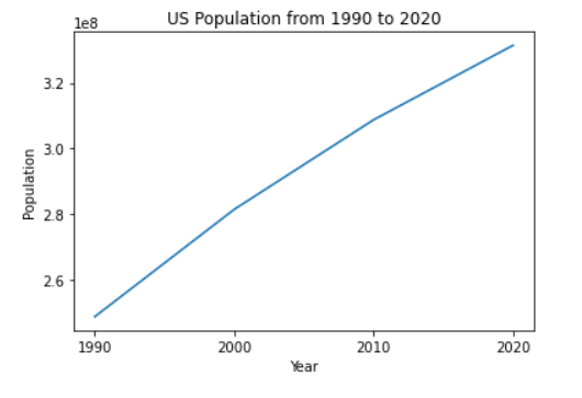
import matplotlib.pyplot as plt # Here, we are going to import Matplotlib, a plotting library for Python.
language = ["German", "Turkish", "Arabic", "Other"] # Here, we are going to define the languages.
percent = [90, 2, 6, 1] # Here, we are going to define the percentage of people in Germany that speak German, Turkish, Arabic, or Other, respectively.
plt.pie(percent, labels = language) # Here, we are going to plot the pie chart. 

Simple Pie Chart Using matplotlib

Creating a Pie Chart in Python using matplotlib

Line Chart

Line charts are used for representing how a variable changes across a period. Below, we will observe how a line chart is used to show how the population of the US changed from the years 1990 to 2020.

import matplotlib.pyplot as plt # Here, we are going to import Matplotlib, a plotting library for Python.
year = ["1990","2000", "2010", "2020"] # Here, we are going to define the years.
population = [248709873, 281421906, 308745538, 331449281] # Here, we are going to define the population. 
plt.title("US Population from 1990 to 2020") # Here, we are going to define the title of our line chart.
plt.xlabel("Year") # Here, we are going to define the x-axis of our line chart.
plt.ylabel("Population") # Here, we are going to define the y-axis of our line chart.
plt.plot(year, population) # Here, we are going to plot the line chart.

Simple Line Chart Using matplotlib

Creating a Line Chart in Python using matplotlib