Bar charts are excellent visualizations to show the frequency of categorical data. Often, it is valuable to quickly create a frequency bar chart from a DataFrame of thousands of observations.
When visualizing complex data, such as a simulation of guessing on a true/false exam with 10 questions, we can quickly create a frequency bar chart of this data:
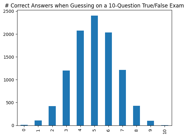
import pandas as pd\nimport random\n \n# Simulation of Randomly Guessing on a 10-Question True/False Exam:\ndata = []\nfor i in range(10000):\n # Simulate taking a 10-question true/false exam, guessing on every question:\n correctAnswers = 0\n for q in range(10):\n correctAnswers = random.choice([0, 1])\n \n d = {"correctAnswers": correctAnswers}\n data.append(d)\n \ndf = pd.DataFrame(data)\n \n# Creating a Frequency Bar Chart of Correct Answers:\nfreq = df["correctAnswers"].value_counts().sort_index()\nfreq.plot.bar(title="# Correct Answers when Guessing on a 10-Question True/False Exam")
Reset CodeRun All to Here Python Output:
Creating a Frequency Bar Chart
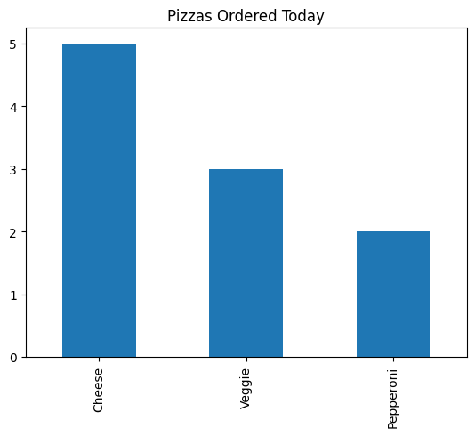
To understand the code to create a frequency bar chart, let's start with a simple DataFrame that stores data about each pizza that was ordered today:
The panda's function value_counts() counts the number of times each unique value appears in a column of a DataFrame. In our sample DataFrame, we can count the unique values of the pizzaOrder:
When we use the value_counts() functions, the result is a Series and can be directly visualized -- it's common to see all of this done in a single line!
A frequency bar chart of the different types of pizza:
When working with numeric values, sorting the order in which the values appear in the bar chart becomes critical. There are two ways we might need to sort the data:
Sorting the data based on the category (ex: by the pizza toppings) so that the values along the x-axis are ordered, OR
Sorting the data based on the frequency (the number of occurrences) so the categories are in increasing/decreasing frequency
We'll explore an simulation to see the two ways to sor the data.
Application: Large Scale Simulation of Guessing on an Exam
An extremely common application of frequency bar charts is in the exploration of simulation results. For example, the following code simulates taking an exam with 10 true/false questions and guessing on each question. The DataFrame stores the result of how many questions each of the 10,000 simulated students answers correctly when guessing randomly:
import pandas as pd\nimport random\n \ndata = []\nfor i in range(10000):\n # Simulate taking a 10-question true/false exam, guessing on every question:\n correctAnswers = 0\n for q in range(10):\n correctAnswers = random.choice([0, 1])\n \n d = {"correctAnswers": correctAnswers}\n data.append(d)\n \ndf = pd.DataFrame(data)\ndf
Reset CodeRun All to Here Python Output:
correctAnswers
0
2
1
2
2
8
3
6
4
6
...
...
9995
7
9996
4
9997
4
9998
5
9999
5
By using value_counts() and plot.bar(), we can quickly visualize the distribution of the simulation:
import pandas as pd\nimport random\n \ndata = []\nfor i in range(10000):\n # Simulate taking a 10-question true/false exam, guessing on every question:\n correctAnswers = 0\n for q in range(10):\n correctAnswers = random.choice([0, 1])\n \n d = {"correctAnswers": correctAnswers}\n data.append(d)\n \ndf = pd.DataFrame(data)\ndf["correctAnswers"].value_counts().plot.bar(title="# Correct Answers when Guessing on a 10-Question True/False Exam")
Reset CodeRun All to Here Python Output:
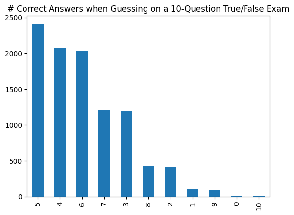
Sorting By Frequency
By default, value_counts() sorts the list of values by frequency so that the most common value appears first on the list returned by value_counts() and will display on the left-hand side of the chart.
import pandas as pd\nimport random\n \ndata = []\nfor i in range(10000):\n # Simulate taking a 10-question true/false exam, guessing on every question:\n correctAnswers = 0\n for q in range(10):\n correctAnswers = random.choice([0, 1])\n \n d = {"correctAnswers": correctAnswers}\n data.append(d)\n \ndf = pd.DataFrame(data)\ndf["correctAnswers"].value_counts()
This creates a visualization with decreasing frequency moving from left-to-right, but with out-of-order data listed along the x-axis (note that the x-axis is 5, 4, 6, 7, 3 ...):
Frequency bar chart visualizing the simulation results of 10,000 students randomly guessing on a 10-question true/false exam, sorted by frequency
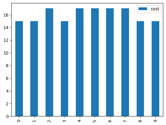
Sorting by Category/Index
It is common to want to sort by the category (stored in the index of the Series returned by value_counts()). To create a bar chart sorted by the index, we add sort_index() after value_counts(). The result is that the data is now sorted by the category name instead of the frequency:
import pandas as pd\nimport random\n \ndata = []\nfor i in range(10000):\n # Simulate taking a 10-question true/false exam, guessing on every question:\n correctAnswers = 0\n for q in range(10):\n correctAnswers = random.choice([0, 1])\n \n d = {"correctAnswers": correctAnswers}\n data.append(d)\n \ndf = pd.DataFrame(data)\nfreq = df["correctAnswers"].value_counts().sort_index()\nfreq
import pandas as pd\nimport random\n \ndata = []\nfor i in range(10000):\n # Simulate taking a 10-question true/false exam, guessing on every question:\n correctAnswers = 0\n for q in range(10):\n correctAnswers = random.choice([0, 1])\n \n d = {"correctAnswers": correctAnswers}\n data.append(d)\n \ndf = pd.DataFrame(data)\nfreq = df["correctAnswers"].value_counts().sort_index()\nfreq.plot.bar(title="# Correct Answers when Guessing on a 10-Question True/False Exam")
Reset CodeRun All to Here Python Output:
(Run your code to see your code result's here.)
We find our visualization now organizes the data by the category instead of the frequency:
Frequency bar chart visualizing the simulation results of 10,000 students randomly guessing on a 10-question true/false exam, sorted by category