Correlated, Uncorrelated, and Independent Random Variables
A pair of random variables can have three kinds of relationships: correlated, uncorrelated, or independent.
- Correlated: A pair of variables change together, either positively or negatively.
- Uncorrelated: There's no predictable relationship between the two variables.
- Independent: Knowing one variable gives no information about the other. They are completely unrelated.
Correlation Coefficient
Linear correlation, often referred as correlation, is a statistical measure that captures the degree of a linear relationship between two random variables. The correlation coefficient, computed between a pair of random variables, determines whether the variables are correlated or uncorrelated.
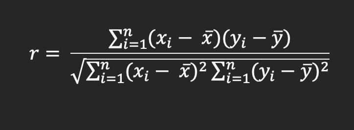
Where:
- r is the correlation coefficient
- xi is values of the x variable in a sample
- $\bar x$ is the mean of the values of the x variable
- yi is values of the y variable in a sample
- $\bar y$ is the mean of the values of the y variable
- n is the number of x and y variable samples
Interpreting Correlation Coefficient Values
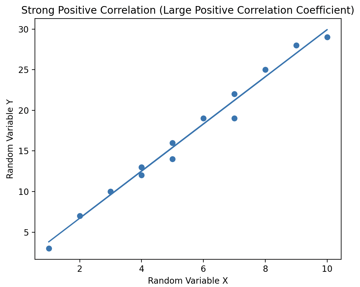
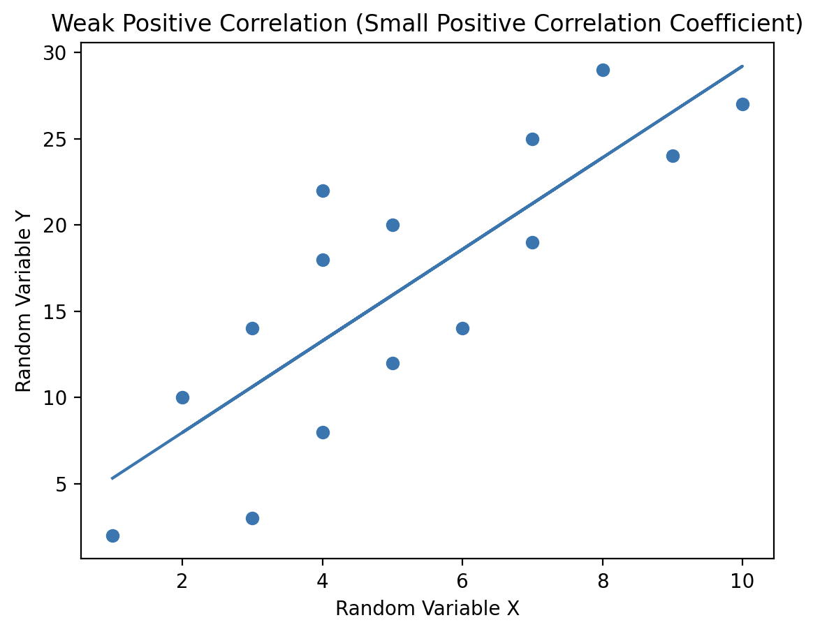
Correlation coefficient values range from -1 to +1, providing two key insights:
- The sign of the value indicates the type of linear relationship between the variables.
- A positive value (+) indicates that as one variable increases, so does the other (positive linear slope).
- A negative value (-) indicates that as one variable decreases, so does the other (negative linear slope).
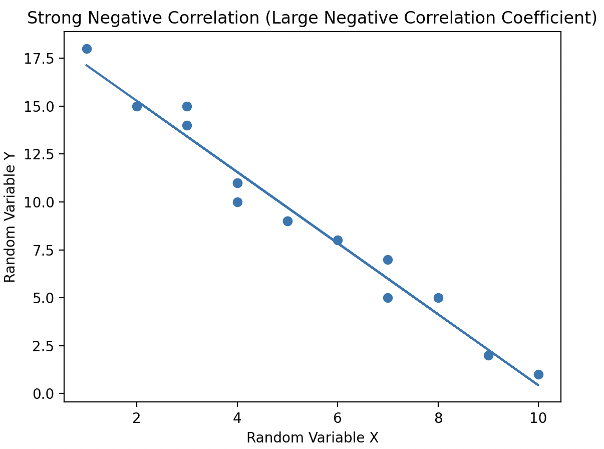
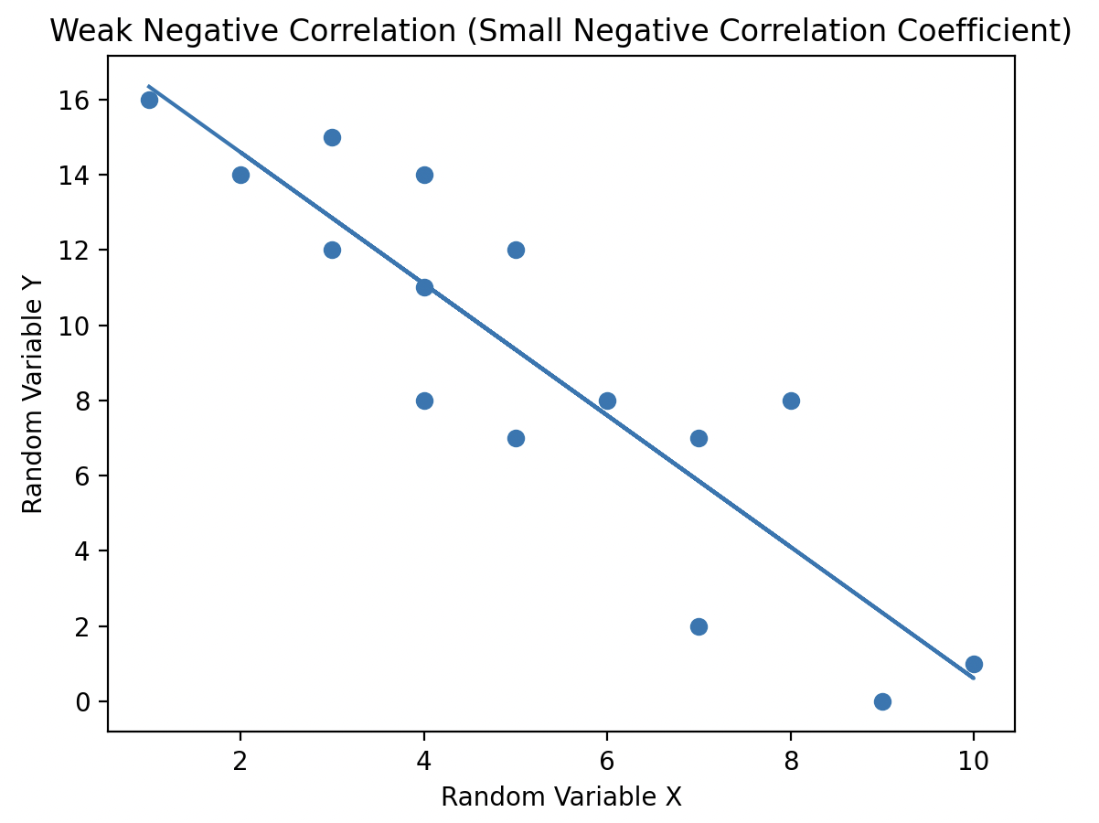
- The magnitude of the correlation coefficient captures the strength of the linear relationship between the variables. A higher magnitude signifies a stronger linear relationship between the random variables.
- A correlation coefficient of 1 or -1 indicates a strong relationship
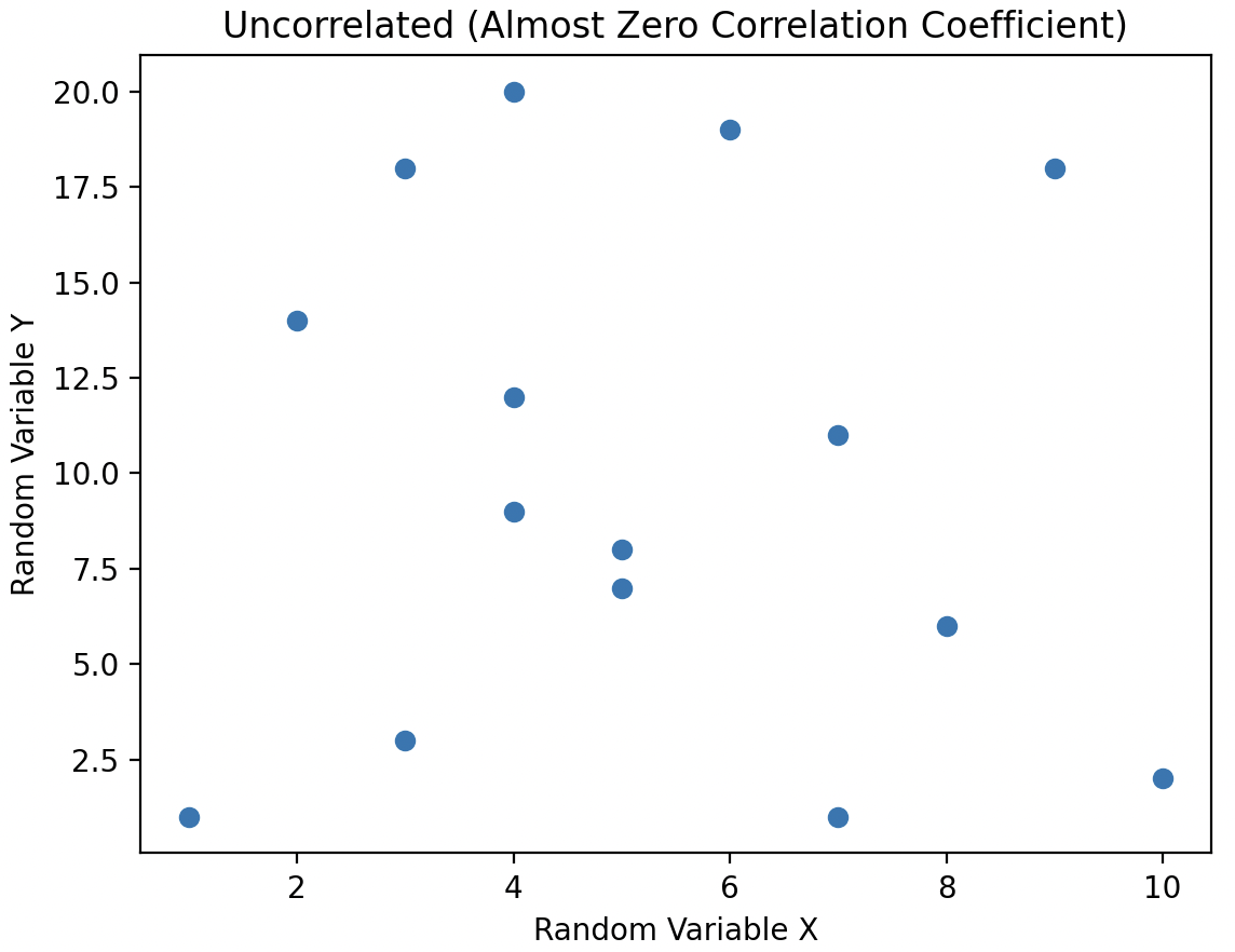
When a pair of random variables has a correlation coefficient value of 0, they are considered uncorrelated. In this case, there is no linear relationship between the variables, meaning no line can be drawn through the scatter plot to capture any trend or relationship between them.
Uncorrelated vs. Independent Random Variables
Uncorrelated random variables have no linear dependence between them, however, the two variables can be non linearly dependent.
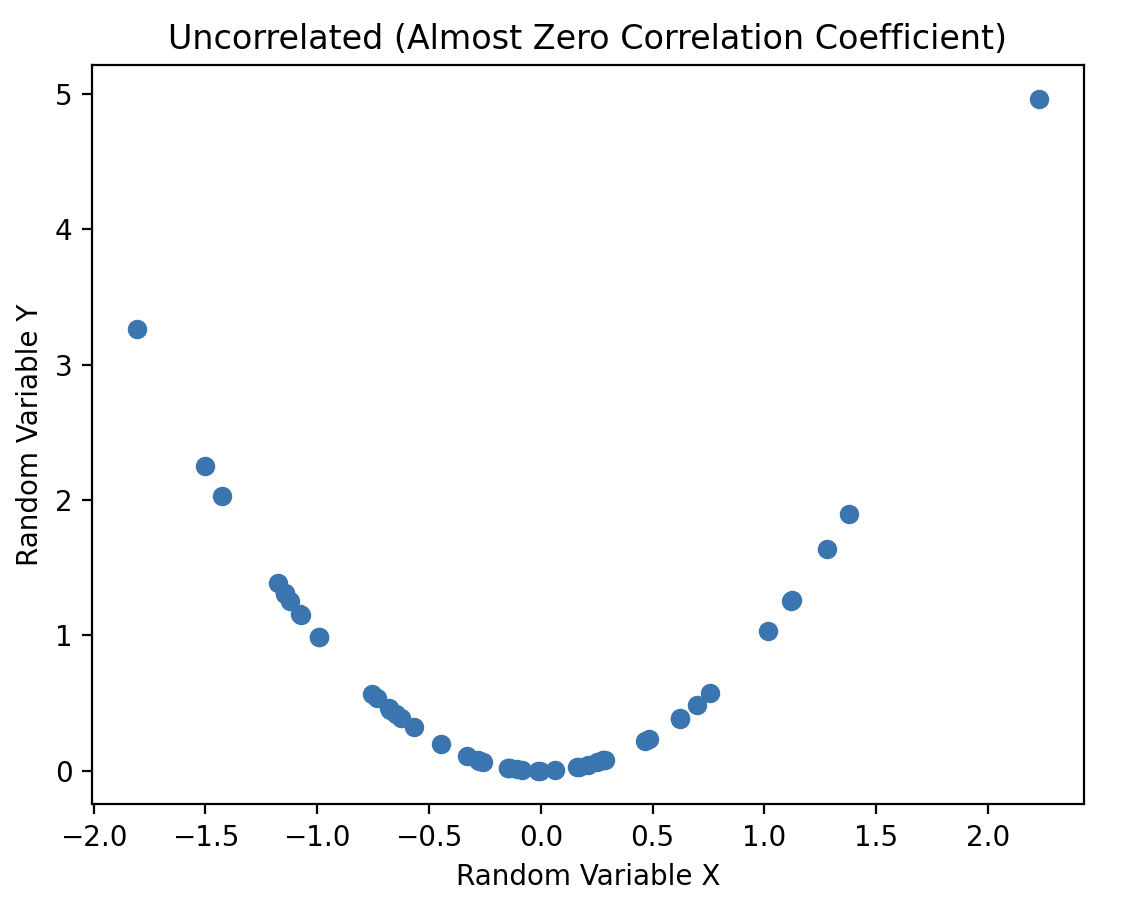
In the plot, the variables have a correlation coefficient close to zero, indicating they are uncorrelated. However, they are still dependent because knowing the value of variable X accurately predicts the value of variable Y through a simple non-linear relationship: squaring the X value to obtain Y.
Tip: When working with statistical data, always study data plots. It can be misleading to claim there is no statistical relationship when there is an obvious "smile" on the scatter plot!
When variables are dependent, knowing the value of one can predict the other:
- Linearly dependent variables: A line of best fit is used for prediction.
- Uncorrelated but non-linearly dependent variables: A non-linear relationship can be drawn for prediction.
- Independent variables: There's no mathematical relationship. Knowing one variable (X) gives no information about the other (Y).
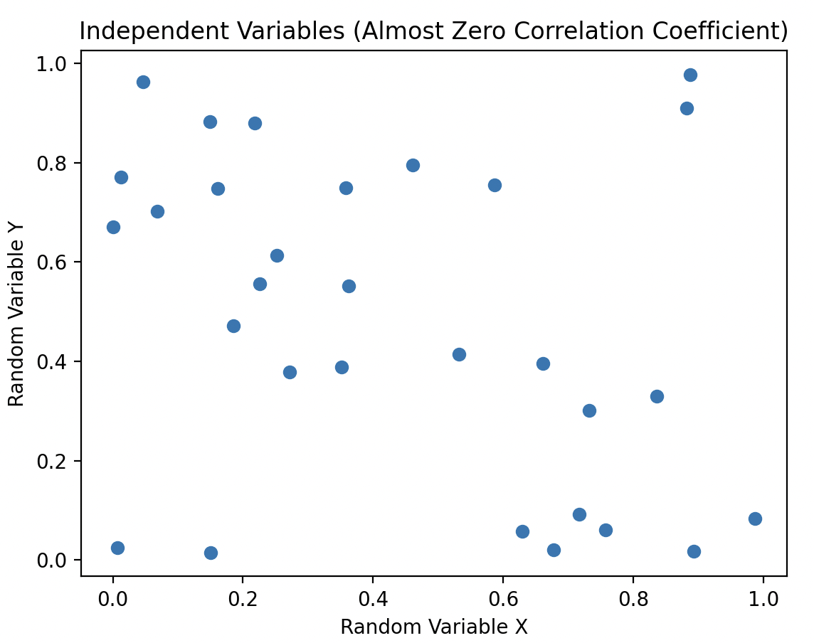
Independent variables have a correlation coefficient close to 0. All independent random variables are uncorrelated. However, it's not necessary for uncorrelated variables to be independent; they could still be non-linearly dependent.
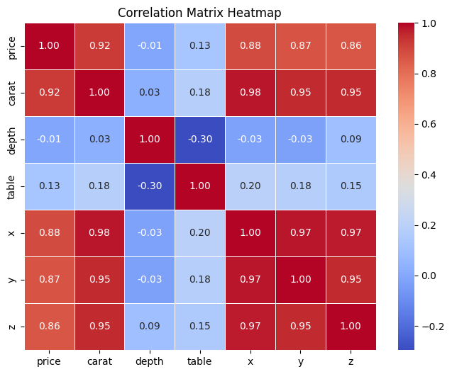
Correlation Matrix
A correlation matrix is a table that displays the correlation coefficients between multiple variables in a dataset. Each row and column in the matrix represent a variable, and the cells contain the correlation coefficients between the corresponding pairs of variables. It's a useful tool in statistics and data analysis for understanding the relationships between variables.
Taking a closer look at the matrix, we can identify some patterns:
- It's a symmetric matrix. A matrix remains unchanged when you swap its rows and columns.
- The diagonal elements are always 1, since it's the correlation with the variable itself, indicating a perfect correlation.
- For off-diagonal elements, they range from -1 to 1, and suggests how strongly two variables are related.
# Import the libraries
import numpy as np
import pandas as pd
import seaborn as sns
import matplotlib.pyplot as plt

 # Import the diamonds dataframe
df = pd.read_csv("https://waf.cs.illinois.edu/discovery/diamonds.csv")
new_df = df[["price", "carat", "depth", "table","x", "y", "z"]]

# Calculate correlation matrix
correlation_matrix = new_df.corr()| price | carat | depth | table | x | y | z | |
|---|---|---|---|---|---|---|---|
| price | 1.000000 | 0.921591 | -0.010647 | 0.127134 | 0.884435 | 0.865421 | 0.861249 |
| carat | 0.921591 | 1.000000 | 0.028224 | 0.181618 | 0.975094 | 0.951722 | 0.953387 |
| depth | -0.010647 | 0.028224 | 1.000000 | -0.295779 | -0.025289 | -0.029341 | 0.094924 |
| table | 0.127134 | 0.181618 | -0.295779 | 1.000000 | 0.195344 | 0.183760 | 0.150929 |
| x | 0.884435 | 0.975094 | -0.025289 | 0.195344 | 1.000000 | 0.974701 | 0.970772 |
| y | 0.865421 | 0.951722 | -0.029341 | 0.183760 | 0.974701 | 1.000000 | 0.952006 |
| z | 0.861249 | 0.953387 | 0.094924 | 0.150929 | 0.970772 | 0.952006 | 1.000000 |
Correlation Heatmaps
A correlation heatmap is a visual representation of the correlation matrix, typically displayed as a grid of colored cells. It's a way to quickly identify which variables are positively correlated, negatively correlated, or uncorrelated with each other.
Each cell in the heatmap has a color associated with the correlation coefficient that indicates the strength and direction of correlation. Typically, darker colors (e.g., red) represent stronger positive correlations, lighter colors (e.g., blue) represent stronger negative correlations, and a neutral color (e.g., white) represents little or no correlation.
plt.figure(figsize=(8, 6)) # Set the figure size to 8x6 inches

# annot=True displays the correlation values in each cell
# cmap sets the color map to coolwarm, representing positive correlations with warm colors and negative correlations with cool colors
# fmt=".2f" formats the values as floating-point numbers with 2 decimal places
# linewidths=0.5 sets the width of the lines that divide each cell in the heatmap to 0.5
sns.heatmap(correlation_matrix, annot=True, cmap='coolwarm', fmt=".2f", linewidths=0.5)

plt.title('Correlation Matrix Heatmap')
plt.show()