Basic Data Visualization in Python
The pandas library makes it extremely easy to create basic data visualizations and provides built-in utilities for all common data visualizations:
df.plot.bar(...), to create a bar plot (or add anhfor.barhfor a horizontal bar chart)df.plot.line(...), to create a line plotdf.plot.scatter(...), to create a scatter plotdf.plot.hist(...), to create a histogramdf.plot.box(...), to create a box plot- ...and
df.plot.pie,df.plot.hexbin, and more.
Selecting Columns for Visualizations
By default, each visualization will display all numeric columns of data -- which is often A LOT of data. For example, the Illini Football Dataset contains four numeric columns: Season (ex: 2021), OpponentRank (ex: 3), IlliniScore (ex: 21), and OpponentScore (ex: 14). This means a default visualization will display all four columns:
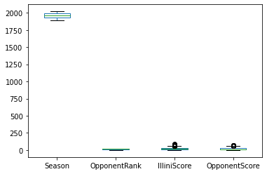
Box plot of all numeric columns in the Illini Football Dataset. (This visualization is not so useful, as the value of Season has values significantly larger than the other values; it is often necessary to graph a subset of the values.)
To create a DataFrame with only a subset of the columns, we need to select a subset of columns. The syntax required to do this will provide the list of column names as an index to the DataFrame as shown below:
Notice that there are two sets of square brackets!
- The first set tells us we're working within the
df, asdf[ ... ]. - The second set is the list of column names where each column name is separated by a comma
["IlliniScore", "OpponentScore"]. - Together, they make the full command to select a subset of columns from our DataFrame.
A default box plot with only the two columns can now be created:
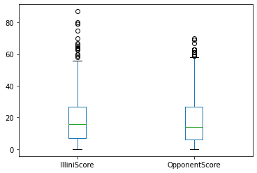
Box plot of only the IlliniScore and OpponentScore columns in the Illini Football Dataset. By selecting a subset of the columns, we are able to focus on data with similar ranges.
Specifying x and y Column Values
Some visualizations require a single column to be plotted on the x or y axis. For example, there is no default scatter plot and Python informs us that both x and y are required:
--------------------------------------------------------------------------- TypeError Traceback (most recent call last) <ipython-input-33-c4b381c47468> in <module>() ----> 1 df.plot.scatter()TypeError: scatter() missing 2 required positional arguments: 'x' and 'y'
Python error message when df.plot.scatter() does not specify the columns names to be used for x and y axes.
When Python informs us that we're missing "missing 2 required positional arguments", we need to specify them in the function call. For all visualizations, the x and y values will be the name of the column to be used. If we wanted to create a scatter plot of the IlliniScore verses the OpponentScore:
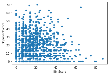
Scatter plot with the IlliniScore on the x axis and the OpponentScore on the y axis.
Chart-Specific Options
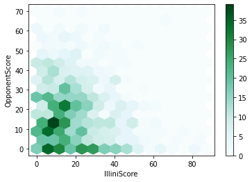
While this visualization is good, there's almost too much data for a scatter plot! Another plot, a hexbin, provides a heat map for of density of each region of a scatter plot. Switching out the .scatter for .hexbin, we get a completely different visualization:
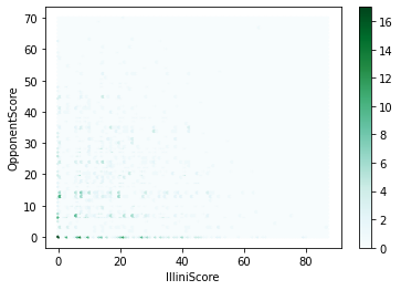
Hexbin plot with the IlliniScore on the x axis and the OpponentScore on the y axis.
Yikes -- this visualization is not great. I can barely see any details.
Every visualization has dozens of individual options to customize -- color, style, and function! The technical documentation for each graph will display all of the different options. The easiest way to find the technical documentation is often to just search for the function: df.plot.hexbin and look for the pandas documentation:

Google Search result of df.plot.hexbin, showing the link for the official pandas documentation for hexbin.
(This link is to https://pandas.pydata.org/docs/reference/api/pandas.DataFrame.plot.hexbin.html.)
All pandas documentation will show a description and a list of parameters with descriptions. For the df.plot.hexbin documentation has several options specific to hexbin including gridsize. The documentation for gridsize reads:
From above, pandas allows us to specify "The number of hexagons in the x-direction." and has a "default [of] 100". What happens if we specify just 15, instead of 100, hexagons in the x-direction?
Hexbin plot with the IlliniScore on the x axis and the OpponentScore on the y axis, with only 15 hexagons in the x-direction.