Quartiles and Box Plots
Just like histograms, box plots (also known as box and whisker plots) are a way to visually represent numeric data. Box plots divide the data into equally sized intervals called quartiles.
Quartiles
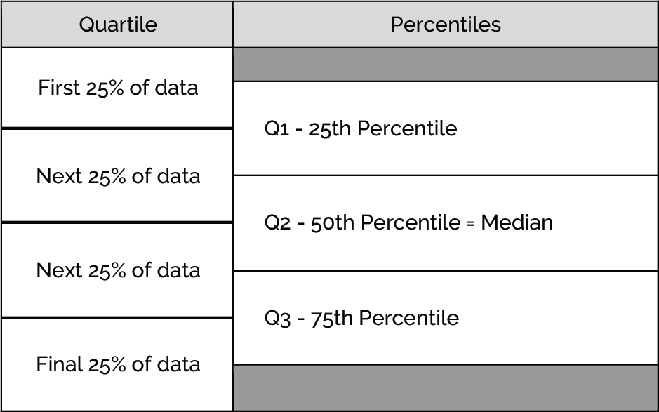
All sets of numeric data can be broken up into quartiles, or four equal sized segments that each contain exactly a quarter (25%) of the data.
The points where the quartiles are split have specific names:
- Q1, the end of the first quartile, is the 25th-percentile. This means that at Q1, there is 25% of the data below that point.
- Q2, the end of the second quartile, is the 50th-percentile (which is also the median). This means that at Q2, exactly half of the data is at or below that point (and exactly half is at or above).
- Q3, the end of the third quartile, is the 75th-percentile. This means that at Q3, there is 75% of the data below that point.
Visually, we can see the data split into the four quartiles by the Q1, Q2 and Q3:
- Calculating Q2: To find Q2, all we have to do is calculate the median of the data
- Calculating Q1 and Q3: To find Q1 and Q3, we want to be as exact as possible. We can't just take the midpoint of two data points. Instead we use the following formula first to find the true index location:
- True Index Location = (# of data points - 1) * percentile of interest
- The percentile of interest is always in decimal form. For example, if we are looking for Q1, the percentile of interest would be 0.25
- After finding the true index location, we can use the following formula to calculate Q1 and Q3:
- (Low #) + (High # - Low #) * fraction %
- In the formula above, low # represents the number to the left of the true index location and high # represents the number to the right of the true index location. Fraction % represents the decimal component of the true index location. For example if true index location = 2.75, the fraction % = 0.75
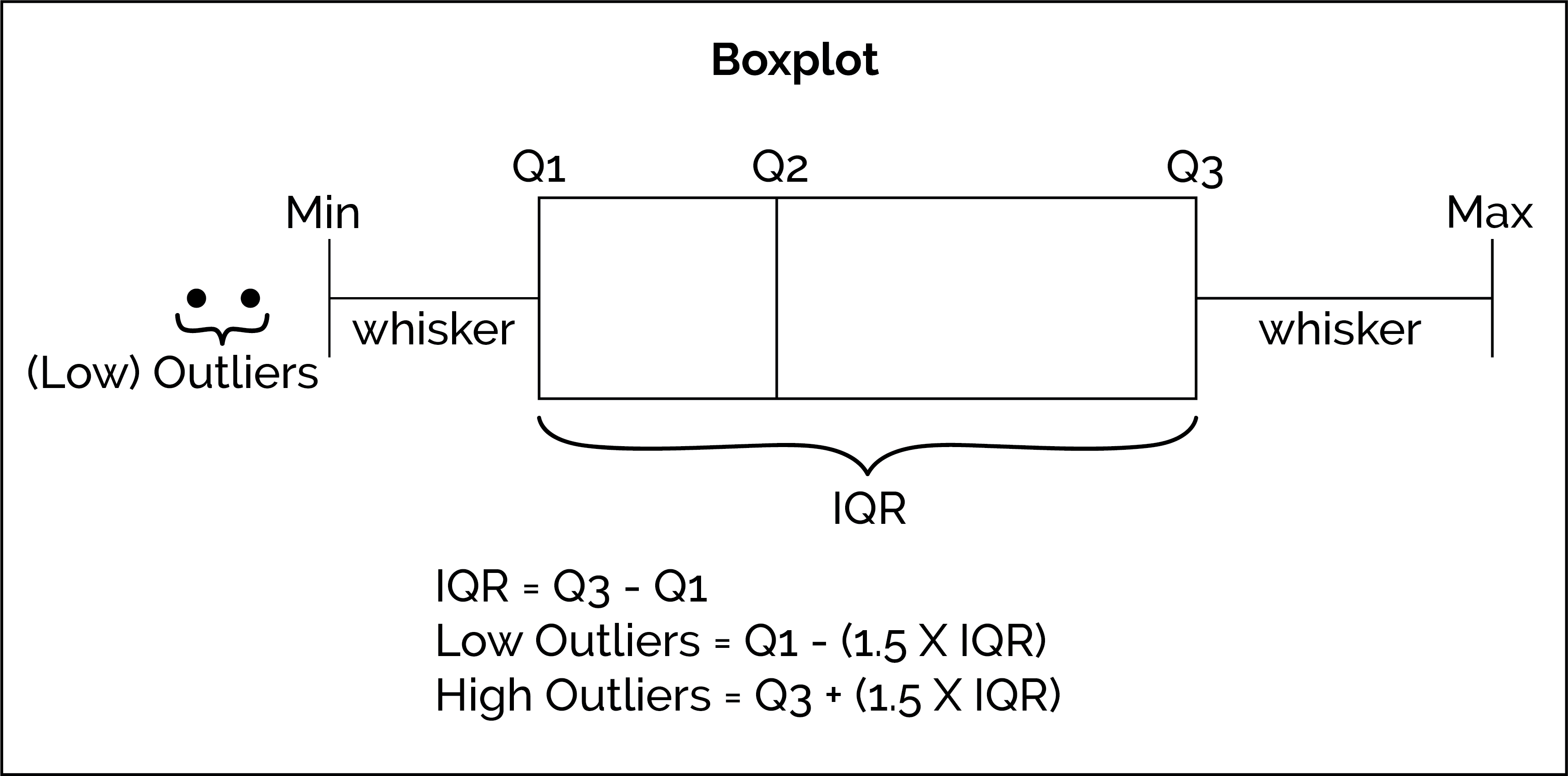
Box Plots
Box plots (also known as box and whisker plots) provide a visualization that provide three key benefits compared to other visualization of data:
Box plots show the size of the center quartiles and the values of Q1, Q2, and Q3.
Box plots show the inter quartile range (commonly called the IQR), a measure of the spread of the data. The IQR is the value of Q3 - Q1.
The IQR tells us the range of the middle 50% of the data. In other words, it tells us the width of the “box” on the box plot.
Box plots show outliers in the dataset. Outliers are data points that differ significantly from most of the other points in the dataset. In other words, they “lie outside” most of the data. They are plotted as single dots on a box plot. You can calculate outliers mathematically using these rules:
- Low Outliers: All values less than Q1 - (1.5 × IQR).
- High Outliers: All values greater than Q3 + (1.5 × IQR).
Outliers can be typos, lies, or real data! Outliers can have a strong effect on certain statistics (like the average) so it’s important that as a data scientist, you recognize outliers and decide if you want to include them in your analysis. Outliers should only be excluded from analysis for a good reason!
Here is an example of a horizontal box plot with each component of the box plot labeled: