Histograms
Histograms are simple ways to visually represent quantitative or numeric data or distributions. Unlike bar graphs, the x-axis of a histogram is always drawn to scale. Histograms can help us visualize the shape of a distribution.
There are two types of histograms that are commonly used:
Frequency Histogram: Frequency histograms show how often different values in a dataset occur. The width of each block indicates the size of the interval and the height of each bar indicates the number of observations in each interval (or bin). Frequency histograms are very simple to interpret and read.
Density Histogram: Density histograms use areas to depict percentages. The width of each block indicates the size of the interval and the area of each block indicates what percentage of the data belongs to that category. The height indicates density or how crowded the block is. Density histograms are used a lot in statistics. In a density histogram, the total area of all the blocks is always 1.00 (100%).
Example: Frequency Histogram
In our first example, student scores on a tough exam have been visualized using a frequency histogram:
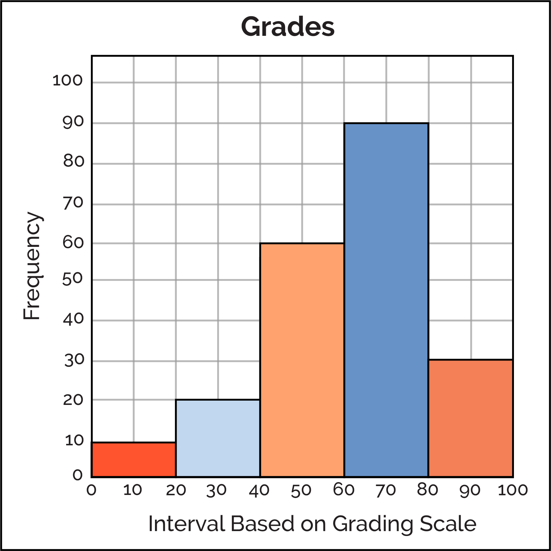
In this visualization, we can observe many details:
There are a total of five bins and each bin has a range of 20 on an exam.
The left-most bin visualizes all students who scored between 0 and 20 on the exam. The height of the bin reveals that 10 students scored between 0 and 20 on the exam. Similarity:
- 20 students scored between 20 and 40,
- 60 students scored between 40 and 60,
- 90 students scored between 60 and 80,
- 30 students scored between 80 and 100.
Example: Density Histogram
In our first example, student scores on a slightly easier exam have been visualized using a density histogram:
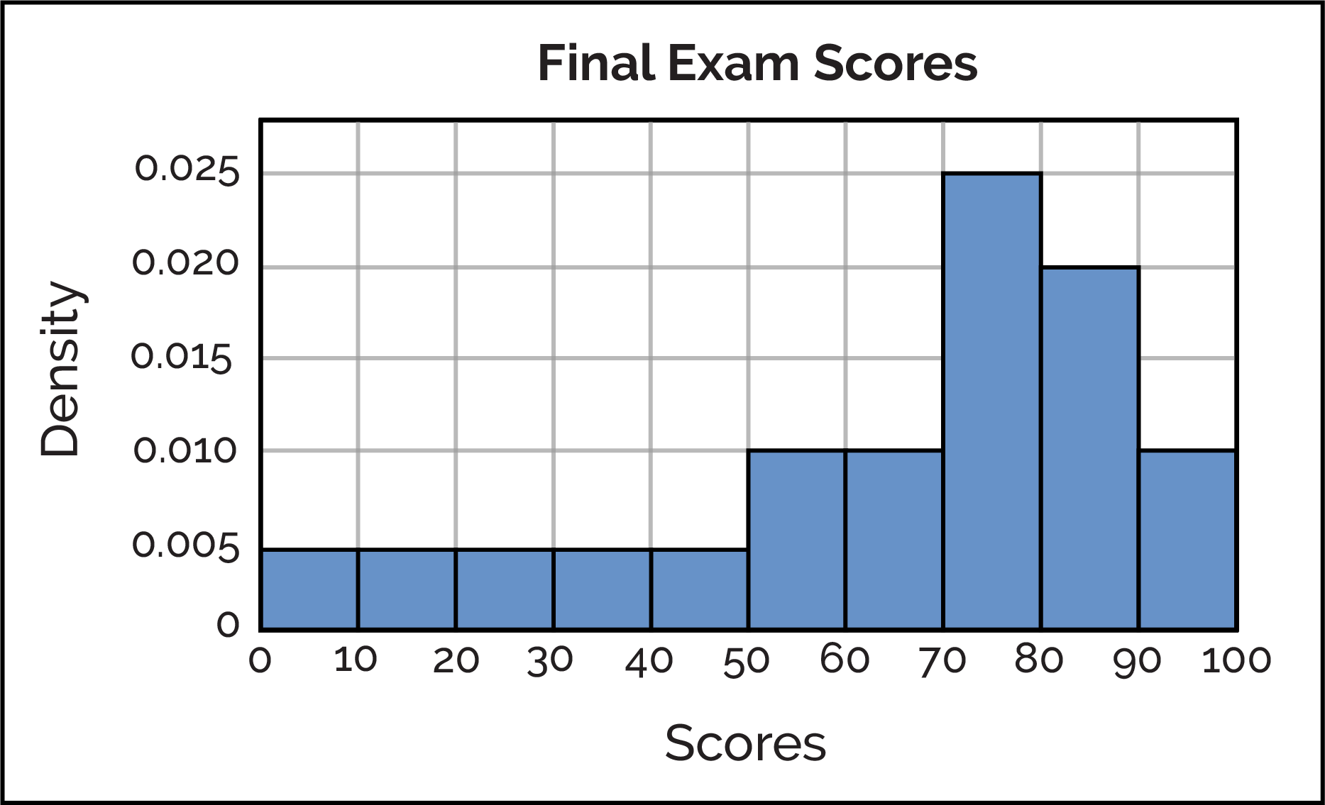
In this visualization, we can observe many details:
There are a total of ten bins and each bin has a range of 10 points on an exam.
Unlike the frequency histogram, the density histogram's area must always be 1.00 (100%). This results in the area of each bin exactly represents the percentage of people in the bin.
The left-most bin visualizes all students who scored between 0 and 10 on the exam. At a height of 0.005 and a width of 10, 0.005 × 10 = 0.05. Therefore, we learn that 5% of all students scored between 0 and 10 on the exam.
The tallest bin, visualizing all students who earned between 70 and 80 on the exam, has a height of 0.025 and a width of 10. By finding the area, 0.025 × 10 = 0.25, we learn that 25% of all students scored between 70 and 80 on the exam.